Android
HABDroid UI concept – OpenHAB for Android
I’ve started automating some of my home using OpenHAB. As a Java programmer it fits into where my skills are and Kai has done an excellent job building an extendable platform. The community support is excellent with a passionate and helpful user base. I’ve managed to cobble together a serial binding for my Oppo bluray player, which I need to extend and then contribute back to the project. It currently just powers the device on and off, sets the verbosity mode to send updates and then listens for status updates for changes in state (playing, stopped, etc). There is a lot more in the Oppo API which I should add and test.
I’m also an Android user and have done some development. So I downloaded a recent debug HABDroid APK from cloudbees and am trying it out. Most of the commits appear to be the work of belovictor and he’s done an amazing job on this app. I especially like the Material updates applied in the recent cloudbees builds.
The HABDroid app does seem to focus on Items and their statuses rather than leading the user through Task based execution. This could be because that’s what most of the example Site map files show, or it could be factor of the target audience OpenHAB is currently aimed at. This audience appears to be developers or tinkerers, rather than their families or housemates.
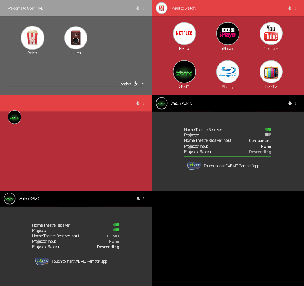
This got me thinking. If I am to subject my family to the OpenHAB experience, I would like it to be simple, convenient and user friendly. The MythTV community talks a lot about WAF, or Wife Acceptance Factor. I believe UX plays a large part in this. To this end, I have been mulling over some UI concepts that I think could add a bit more “wow” and “WAF” to HABDroid, and which embrace the animations and transitions now available in Android’s material design.

Click to view at full size
The above animation is scaled down due the limitations of the theme on this blog. To view it properly, I suggest you click it and see it full size.
Credits and attributions
The following items were used in this mock up.
- Climacons – Used for the weather icon
- Jeremy from Sallee Design – The speaker icon is in the music set on this page
- SAMURAY – The popcorn icon is a member of the Movie Icon Set
- PSDgraphics – Have the retro TV icon
- The XBMC logo is copyright to the XBMC project. Somehow I missed the name change to Kodi. I’m still running an old XBMC on my RaspberryPi.
- Icons for YouTube, BBC iPlayer and Netflix are copyright to their respective companies. Used without seeking permission.
The HABDroid UI Concept
The UI shown in the animation above introduces a few new concepts:
- A grid view and a lot more control over layout and colour
- Changing colour schemes between fragments
- Animation of the selected item and fragment transitions
- Automatic execution of Item state changes
- An “Intent” Item which allows starting another Android application via an Intent
A grid view and a lot more control over layout and colour
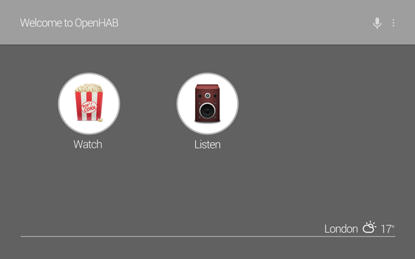
In my household, the interface to OpenHAB is the tablet. HABDroid currently supports a tablet experience by presenting the menus on the left and items on the right. I believe the introduction of a grid view and larger interaction icons suits the task focused, tablet experience well.

For the above layout to be successful, I believe there needs to be additional rendering specifics.
Much more control is needed on Frames. They should be able to consume less than 100% of their parent width, and have alignment capability. I believe the above could be configured like this:
sitemap home label="Welcome to OpenHAB"
                   layout="vertical"
                   darkPrimaryColor="#9e9e9e"
                   primaryColor="#616161"
                   accentColor="#b6b6b6"
                   primaryTextColor="#b6b6b6" {

        Frame layout="grid" h-margin="3%" h-padding="20dp" {
                Group item=GF_Watch label="Watch" icon="popcorn"
                   layout="grid"
                   h-margin="3%" h-padding="20dp"
                   darkPrimaryColor="#b52d38"
                   primaryColor="#e34143"
                   accentColor="#b6b6b6"
                   primaryTextColor="#b6b6b6" {

                        // more items in here
                }
                Group item=GF_Listen label="Listen" icon="speaker" {

                        // more items in here
                }
        }
        Frame layout="horizontal" h-align="right" h-margin="3%" {
                Text label="London" right-padding="10sp"
                Image label="" item=WeatherIcon
                Text label="[%s]" left-padding="10sp" item=WeatherTemp
        }
        Frame layout="horizontal" h-margin="15%" color="#b6b6b6"
              top-padding="1dp" bottom-padding="0px"
              h-padding="0px" bottom-margin="20dp" {
                // Draws a 1dp line across the screen by colouring
                //  a Frame and making it thin and wide.
        }
}
| Elements | Property | Values | Notes |
|---|---|---|---|
| Sitemap, Frame, Group, List?? | layout | vertical, horizontal, grid | Vertical is what HABDroid currently renders. Horizontal is a single line horizontally. Grid displays the items in a grid layout. |
| All Item types | margin, v-margin, h-margin, left-margin, right-margin, top-margin, bottom-margin | examples: 10%, 25dp, 15px, 11sp | Percentage of parent framesize would be a good starting point, but it would also be useful to be able to specify a value that would not change between the four margins. DP is obviously very Android specific. It stands for device pixels and is a scaled pixel count, so that pixels appear to be a similar size for different screen densities PX is for precise amount should it be needed SP is scaled pixels and is similar to DP but factors in the user’s font size settings on the device. |
| All Item types | padding, v-padding, h-padding, left-padding, right-padding, top-padding, bottom-padding | examples: 10%, 25dp, 15px, 11sp | Percentage of parent framesize would be a good starting point, but it would also be useful to be able to specify a value that would not change between the four sides. DP is obviously very Android specific. It stands for device pixels and is a scaled pixel count, so that pixels appear to be a similar size for different screen densities PX is for precise amount should it be needed SP is scaled pixels and is similar to DP but factors in the user’s font size settings on the device. |
| All Item types | v-align, h-align | center, top, bottom, left, right (as applicable) | How to align the item within its parent |
| Frame, Group | color | same as current labelcolor and valuecolor settings | Sets the background colour of a Frame |
| All Item types | label=”” | Ability to set the label to be empty. | I’m not sure if this is currently possible. However, I expect the label to take up no space (visibility=gone in Android) if it’s empty. This is much more applicable for horizontal and grid views than vertical. |
Changing colour schemes between fragments
Since a fragment is represented by a Group in the sitemap (as far as I can tell), adding the colours to the Group element would go a long way to being able to define how a fragment is coloured. Additionally, there is a new library called “Palette” with Android 5 (and backported to previous versions) which allows developers to extract colours from an image and use those colours in the UI. In my experience this is a good start but does not always achieve the nicest looking design. The result varies greatly depending on the image. For some images, the palette library is unable to determine anything other than the Primary colour. Images with large single colour areas seem to suffer this problem.
Therefore, it is advantageous to be able to specify colours rather than relying on the palette library. If no colours are provided in the sitemap, palette could then be invoked to colour the UI based on the icon the user had selected.
To give maximum flexibility in rendering the UI, and to adhere closely to the Material design recommendations, the following colours would need to be able to be specified for a Group.
- Dark primary color
- Primary color
- Light primary color
- Primary text color
- Secondary text color
- Accent color
- Icon color
- Divider color
A useful visualisation of how these colours are used is available on the materialpalette.com website.
Animation of the selected item and fragment transitions
Another feature of modern Android design is the use of animation to indicate to the user how an interaction transitions to a new screen. With recent additions to the Android API, it is now possible to animate transitions from one Activity or Fragment to another, with common elements remaining on screen. I believe it is now possible to achieve the transition effect shown in the animation above. This would go a long way to adding some extra polish to the UI, and giving some good visual clues about how the screens tie together.
Automatic execution of Item state changes
When HABDroid loads a fragment, and an Item in that fragment’s Group has a property of “automatic”, then HABDroid requests OpenHAB to change the state of that Item to the state of the automatic property. For example,
Switch item="switch01" automatic="on"
would tell HABDroid to call the OpenHAB API and set the value of switch01 to the on state if it is not already in that state.
I’m still not completely convinced about this idea, but propose it as I think there are some use cases where it could be a useful feature.
An “Intent” Item which allows starting another Android application via an Intent
As I eluded to earlier, the tablet is our primary interaction tool with OpenHAB. The tablet is also the tool we use for interacting with a number of other devices in the house. For example, we have apps that allow us to control XBMC, the Oppo Bluray player, MythTV, YouTube, MPD and initiate DLNA streams. The logical next step is to allow HABDroid to be able to start these apps when appropriate.
To support this, I propose a new Item be added to OpenHAB, which is an Intent item. Its purpose is to inform HABDroid which Intent to broadcast to the Android OS to start the relevant controller app. In the animation above, OpenHAB presents to the user an icon they can touch to start the XBMC controller application. To be as powerful as possible, the Item should allow “extras” to be configured, so that any context that the app could take advantage of can also be transferred.
It might be useful for HABDroid to allow the user to determine an App’s intent and be able to present a Share button. This is to send the intent detail to the OpenHAB administrator’s email address or similar, since the sitemap normally resides on another computer.
Comments and responses
I’ve opened a ticket on Github. Please post comments and responses there so they are all in one place.